Year
2014
Role
User Experience Design
Team
Jungle Minds
Awards
Dutch Interactive Award 2015 (nominee)
Link
emte.nl
About the project
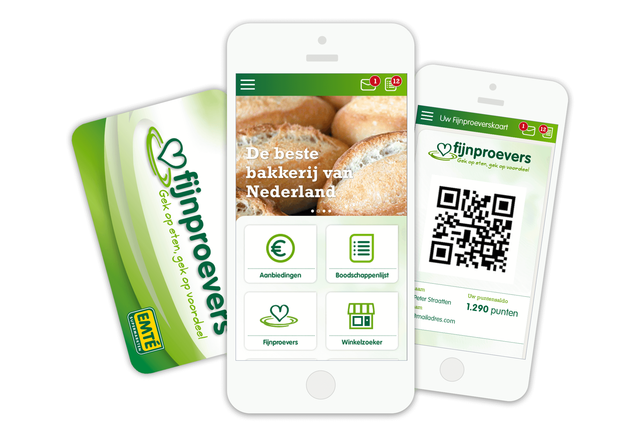
EMTÉ is a supermarket chain off about a 130 supermarkets around the southern and eastern part of The Netherlands and is a part of Sligro Food Group. At the start of the project they stated their ambition to improve their services to their customers in order to convert occasional and regular customers at their stores into loyal customers. Although supermarkets are a highly competitive branch and being able to distinguish oneself is already a day-to-day task, there was a lot of digital potential to accomplish their goals. The solution: a digital based loyalty program called ‘Fijnproevers’, a mobile app and a new responsive website. Combined, these three components enable both their customers to fully enjoy the shopping experience at EMTÉ by offering unique services, as well as enable EMTÉ to get to know their customers better.
Approach
At the start of the project it quickly became clear that the mobile app would be the key touchpoint of the project : connecting the creation of shopping lists at home to the actual grocery shopping at one of the supermarkets. The app would play an important role in offering relevant services throughout that journey. It would hold the digital loyalty-card, which would be used to identify and service individual users. Unique offerings and discounts could be tailored towards specific customer segments. Shopping lists, made at home on either the website or app, could easily be transferred to self-scanning devices in the stores, creating a seamless user experience.
Setting the foundation
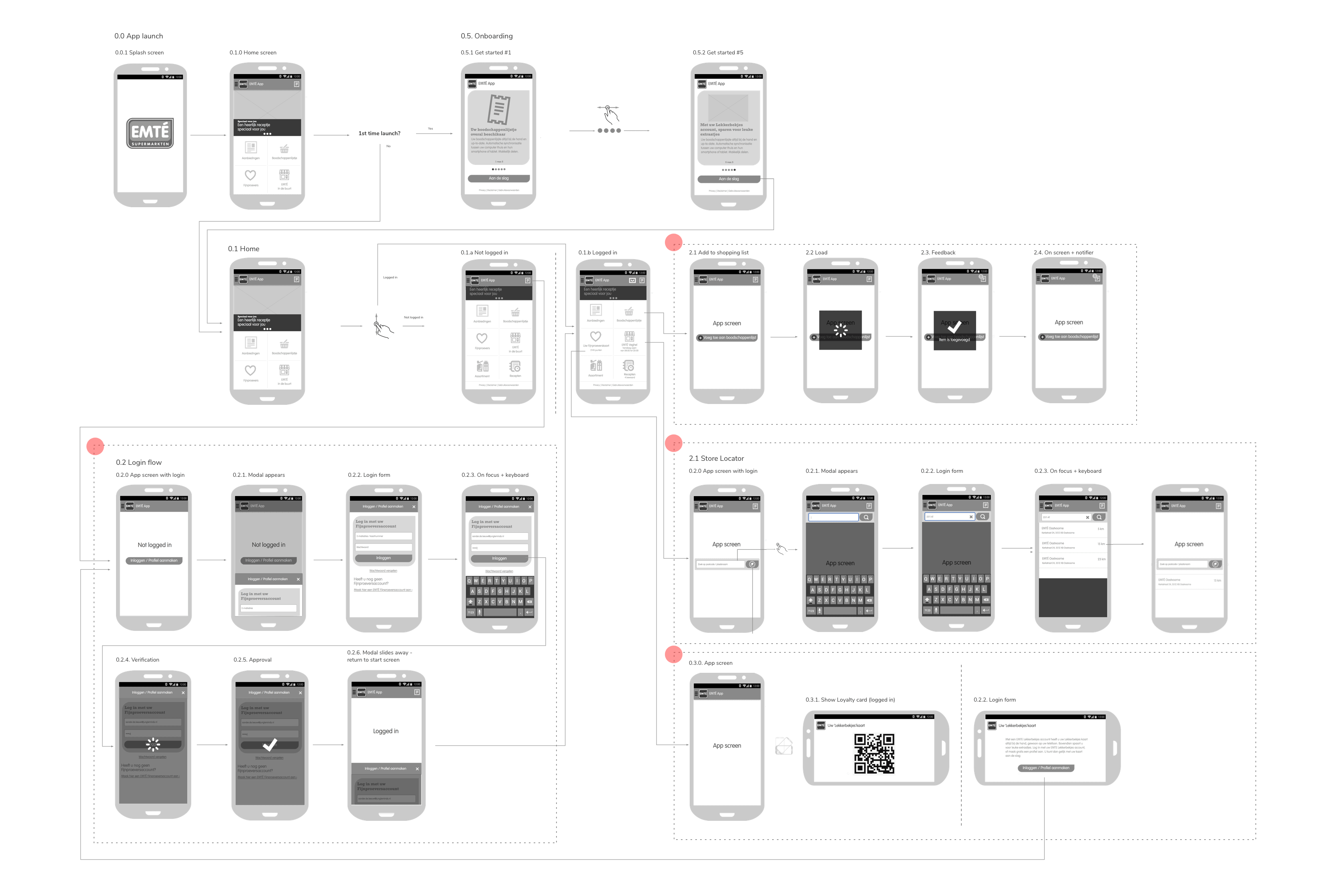
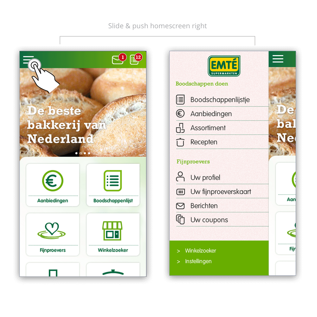
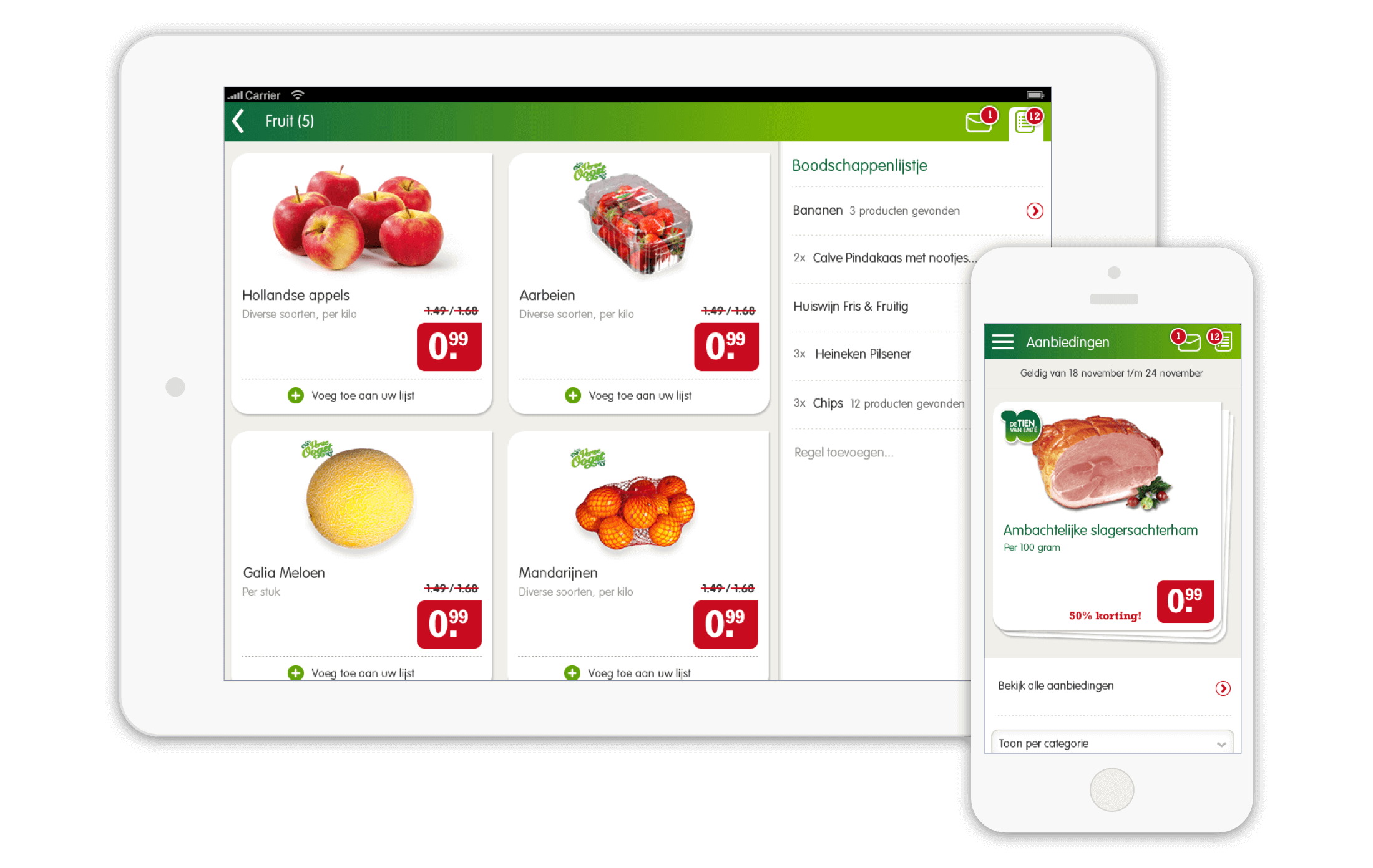
Approaching this project ‘mobile-first’ allowed me to quickly define top tasks for all relevant touchpoints and possible flows between the different (digital) channels. To kickstart development of the app and ‘buy’ time to properly research the customer journey, i drafted out the basic foundations of the app first, covering things like accounts, navigation and other generic processes we could already identify early in the project. Although there were still a lot of unknowns at that time, and ideally i would have started designing this at a later stage, it did help speed up both the design and development process for the remainder of the project because it provided a foundation to build on top on.
Shopping list
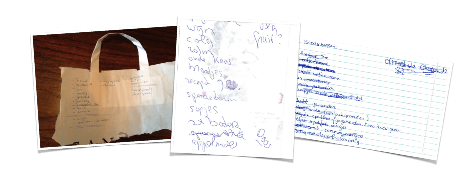
With the foundation of the app in place, i started scoping and mapping out all of the functionalities in both the app and the website. We saw that a lot of features would ultimately be dependent on the shopping list, making this a core feature i needed to explore as soon as possible. Although we had already learnt that most people tend to create their shopping lists using pen and paper, the items on a persons shopping list would generate a lot of customer insights, making it very relevant to motivate users to create them using the app. Together with one of the researchers on the project, we did a quick research-session with users. The main goal was to gain insight in how users create and organise their shopping lists.
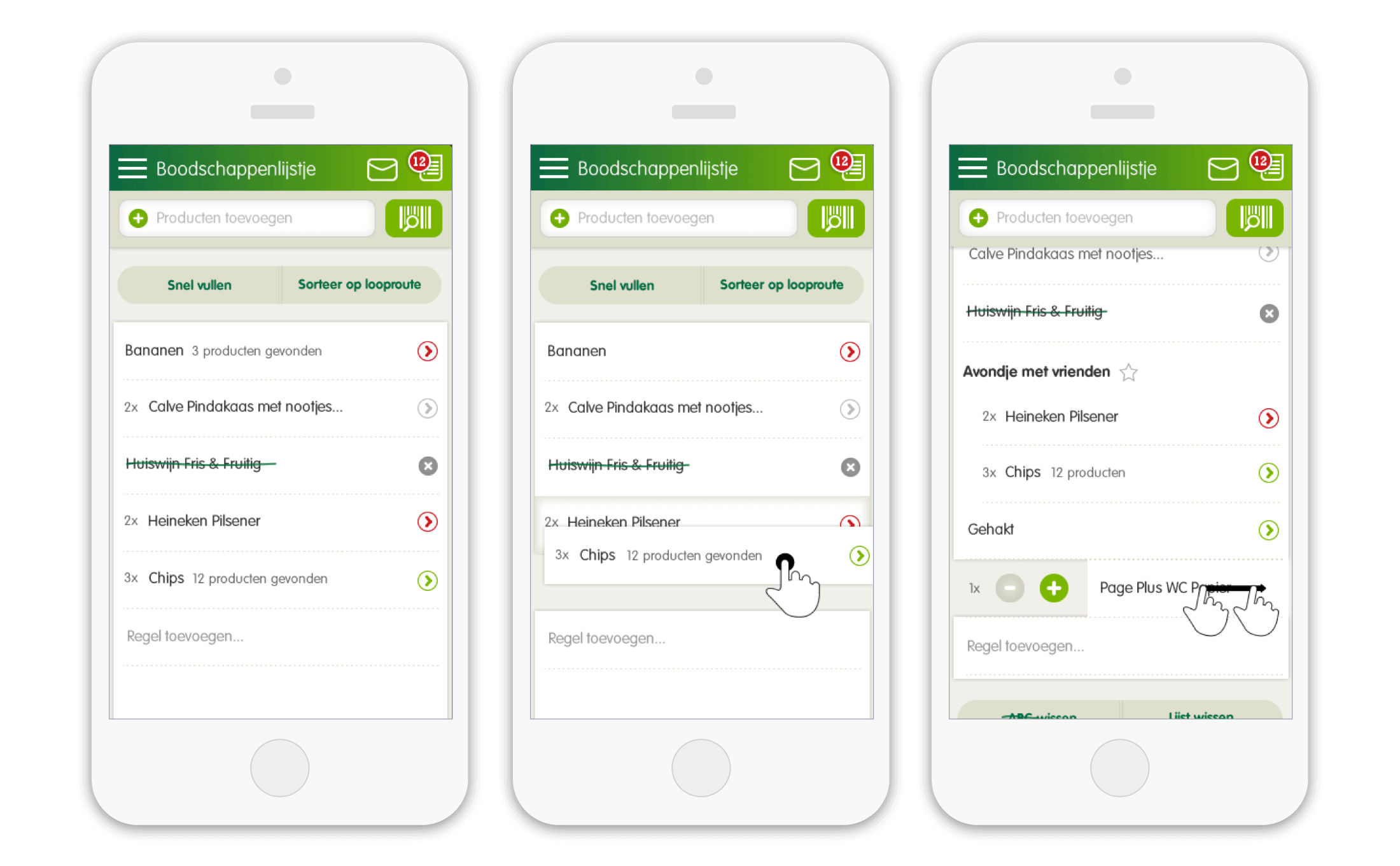
This proofed to be very valuable in the process of making the digital shopping list as intuitive as possible. In analysing the different paper shopping lists we saw a variety of principles people used to categorise and order items but also in checking off items on the list while doing the actual shopping. We used these cues to map out different gestures and functionalities in the shopping list, such as creating indents, grouping items by dragging them on top each other and easy checking off items.
Recipes and inspiration
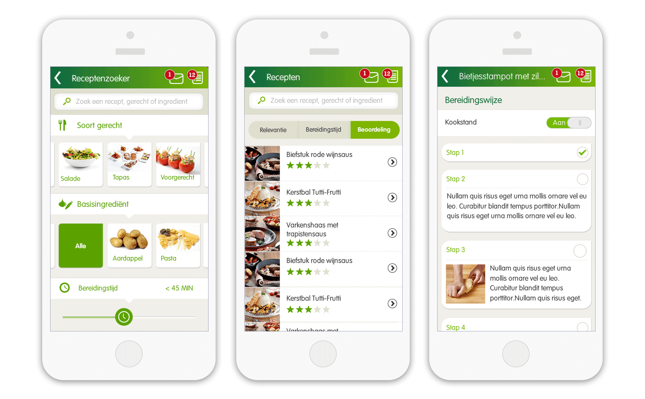
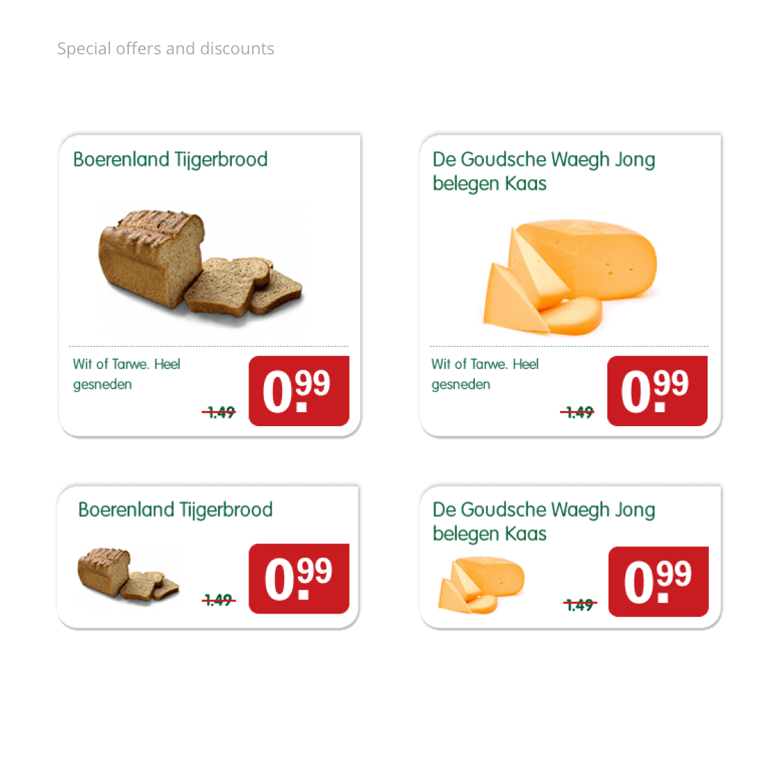
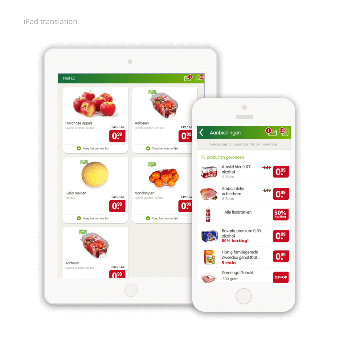
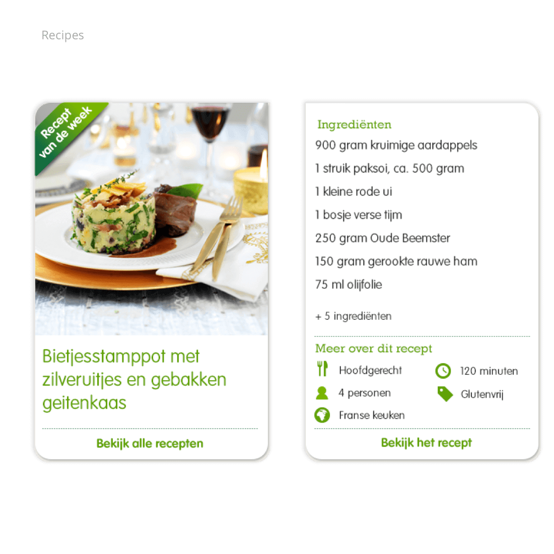
With the core features of the app in place, the next design phase focused on creating multiple points of entry to add items to the shopping list. Additional to the product catalogue, weekly discount offers and the shopping list, we also included a recipe catalogue featuring specific EMTÉ products in each recipe so users could directly add the necessary ingredients to their shopping list. A specific challenge within this flow was to easily discover and select a single recipe from the +1300 recipes available in the app.
Loyalty
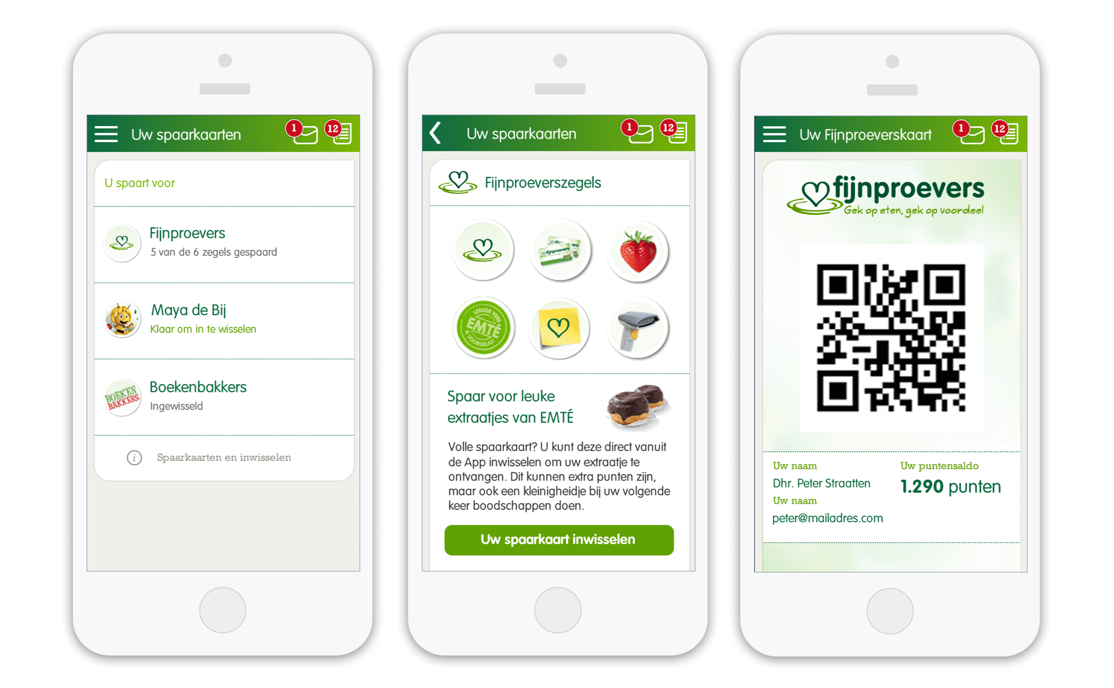
In return for these digital services, EMTÉ want to get to know their customers better. With the new website and app, they also planned for a customer loyalty program, called ‘Fijnproevers’, which would need to be present in the app as well. In the design foundation i had already taken into account for loyalty cards and accounts, but moving towards the end of the design phase of the project, i began thinking more and more about the introduction of the program to customers. As an incentive to start using the app, we proposed to introduce a gamification element in the app. By using the different functionalities of the mobile app and the loyalty program, such as “scanning the digital loyalty card in your supermarket”, customers could collect badges an receive free treats with their next visit to their local ÉMTÉ Store.
The result
The digital loyalty program for EMTÉ launched in september 2014 after an intensive design and development period. Not without results, because within a week after the first public release in september 2014, the new website generated over 3.2. million pageviews and nearly 40.000 downloads in the App-store. Today, nearly a 100.000 customers are active users of the loyalty program and the succes of the digital program even earned us a nomination for the Dutch Interactive Awards 2015.
