About the project
ATAG is a Dutch manufacturer of premium kitchen appliances. Their goal is to design, manufacture and deliver the best possible cooking experience through their products and services. By having a rich heritage within the Netherlands and having (almost) every aspect of their business model done in-house, all the ingredients for a successful business were in place. Except for a fitting digital presence.
Challenge
Traditionally, brands like ATAG offer their products and services towards kitchen retailers and are very rarely in direct contact with consumers. This means that despite all branding efforts, the most decisive factor in the orientation proces of buying kitchen appliances is in the hands of retailers. Besides that lack of control, consumer research also showed that, when it comes to picking out a new kitchen, the colours and materialisation of the kitchen itself are viewed as the most important decisions. The appliances on the other hand are of rather low interest, if discussed at all. For the new ATAG website we set out to change that. We wanted to make people fall in love with the premium appliances of ATAG, preferably before visiting their local kitchen retail store. That meant that we not only needed to reinvent ATAG as a relevant consumer brand, but also as a (digital) brand of preference.
Approach
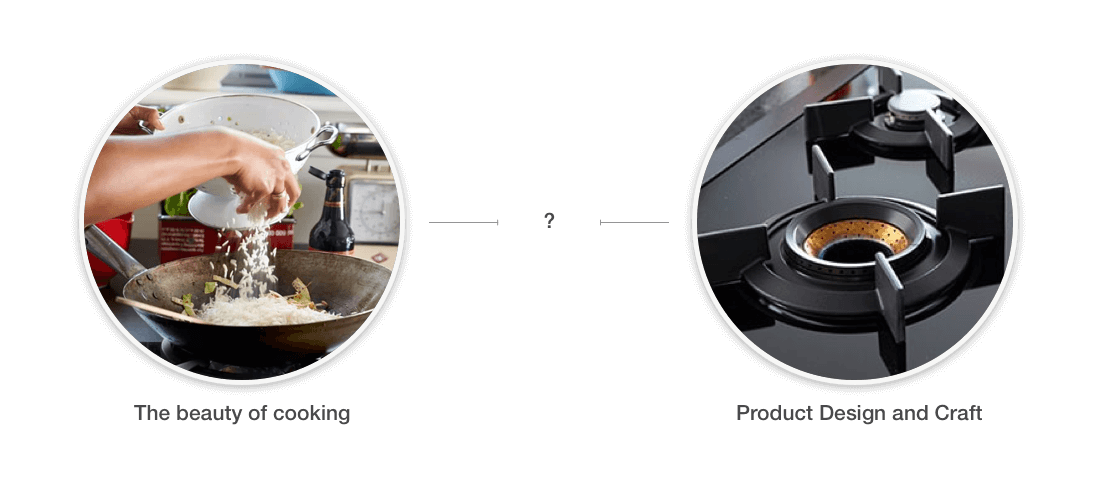
The first challenge to address was getting the all of the stakeholders of the project on the same level and formulate a shared vision. We started out by conducting stakeholder interviews within the company to get a good feeling about their business area and value. Combined with a factory tour, this step proofed to be very valuable for the rest of the project: on the surface every stakeholder held a totally different opinion and vision about the brand. Some found that ATAG was all about the ‘beauty of cooking’ and the appliances only played a facilitating role, while others found that the carefully designed appliances itself should be upfront and that the ‘cooking-experience’ was nothing more than fancy content-marketing. At first it seemed that these visions were opposites of each other, but after some initial brainstorming with the team we found that on a deeper level these different visions could actually complement each other really well.
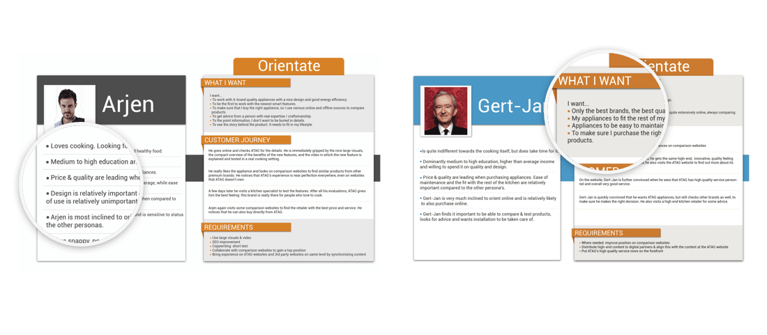
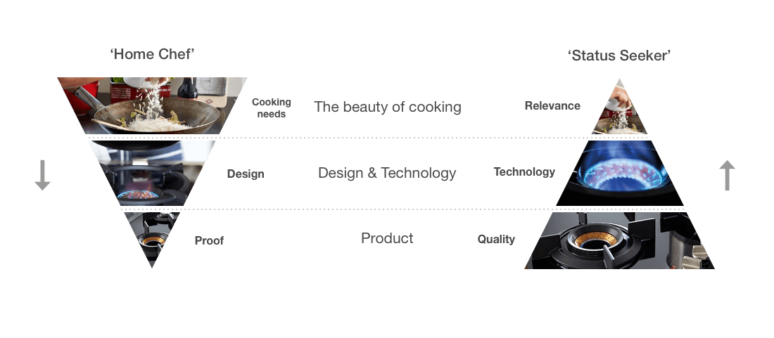
From the initial project discovery, our researchers had distilled two distinct personas from ATAG target group. One persona was the home-chef: someone who really enjoys the activity of cooking and is really keen on learning about the newest techniques and products. This persona doesn’t necessarily have the budget to afford a premium brand of cooking appliances but would definitely have the ambition. The other main persona is the status seeker: a person who doesn’t necessarily care about cooking itself, but does care about good quality products in his or her kitchen. For this persona the premium aspect definitely plays a role in terms of status.
Top down and Bottom up
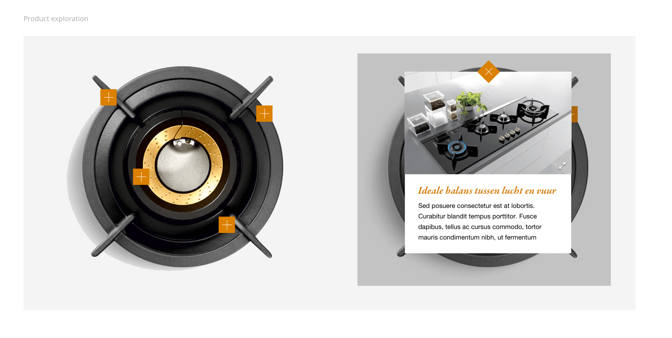
Taking these two personas and combining them with the different points of views from the internal stakeholders, i started plotting a conceptual flow which would not only service both needs, but actually connects them. The home-chef persona could be targeted with content focused on cooking techniques which would lead to specific ATAG products fulfilling that need, whereas the status seeker could be reached with highly polished content focusing on the premium design of the ATAG products and would drill down into the technology being used and ending up with how that technology benefits the cooking experience. The main focus of our rebranding started revolving around the topic that connected both of the experiences: the technique/technology.
The pitch
With our concept worked out in both a high-level flow and a visualisation of the brand, we went back to the stakeholders of ATAG to pitch the idea. Because the concept incorporated both visions about the brand, all the stakeholders in the room almost instantly agreed with our proposal. This was a magical moment, because for the first time in the project there was actually a shared vision and goal in the whole of the company.
Detailed design
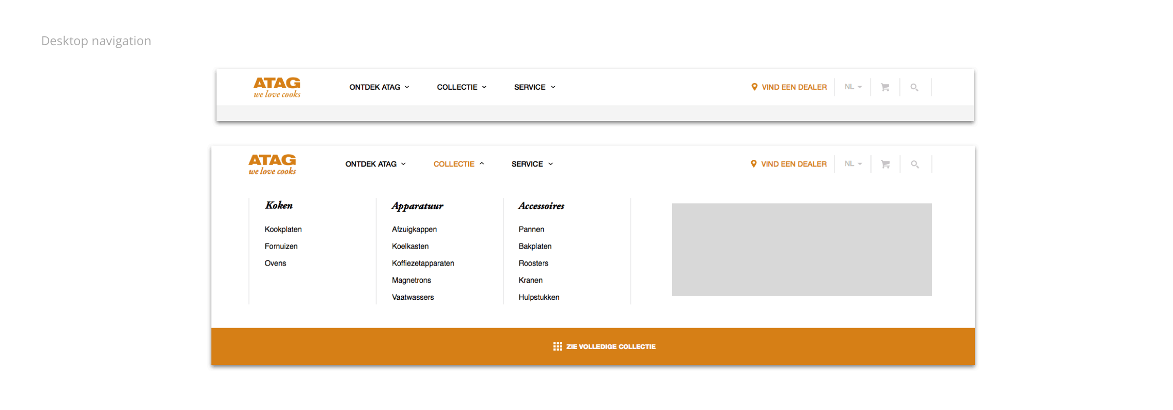
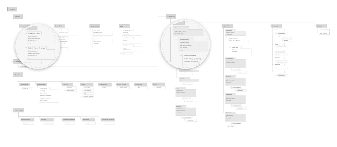
With our proposal approved, we kickstarted the design of both the brand and the new product website. I teamed up with an art director who would focus on the brand and supervise the video production, whereas i would focus more on working out the proposed content flow in the website. I started out with the development of a sitemap and initial wireframes to create a solid foundation for the website.
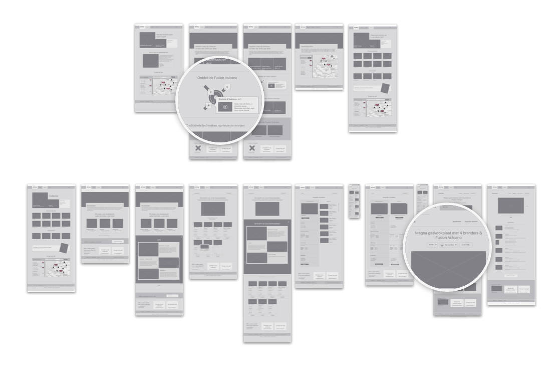
Next i worked on the key pages and flows which would connect both flows. This was a different approach to what i was used to. Normally i would’ve started with the homepage and worked my way down to the detail and content pages, but in this project it made more sense to start with those detail and content pages, since the concept relied so heavily on the inspirational content and products being clearly connected.
Restructuring Product Lines
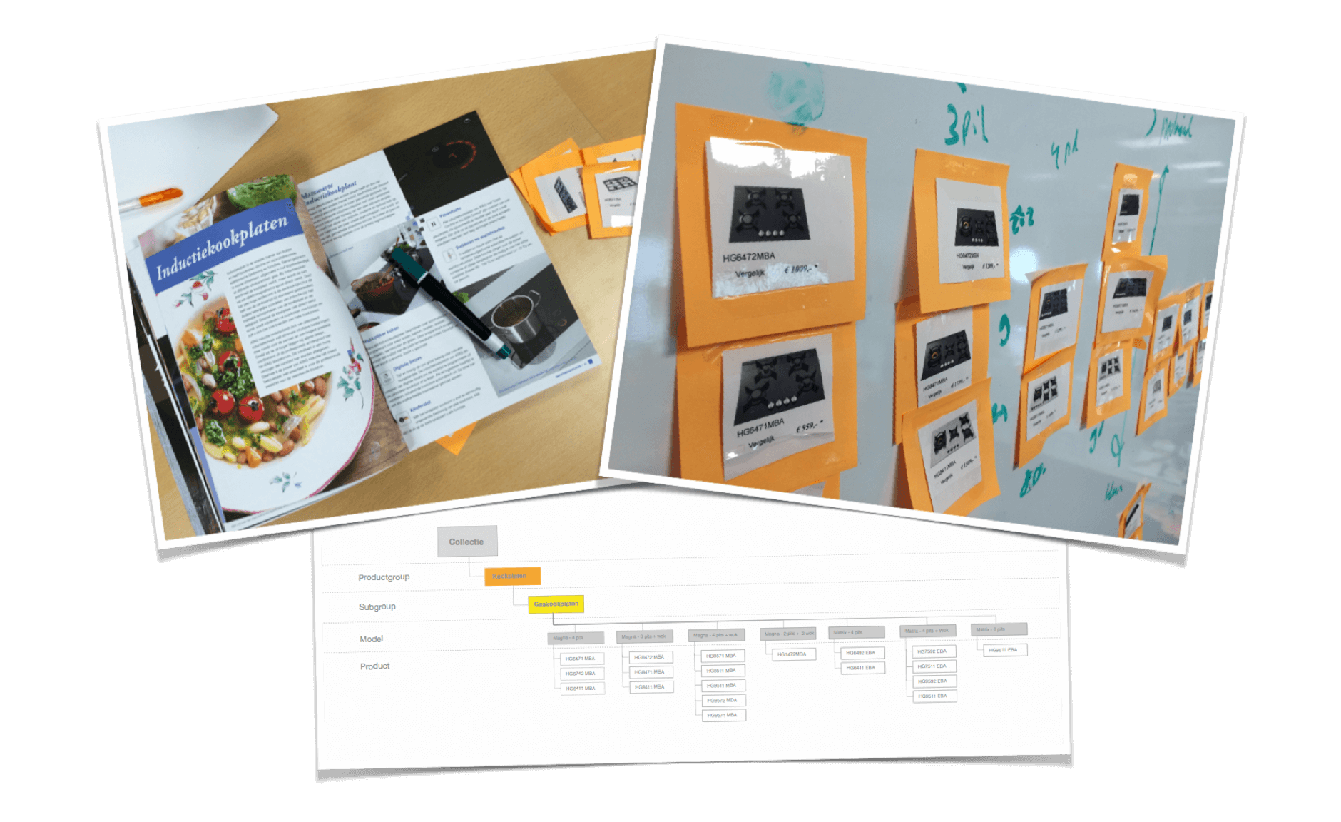
When designing the initial flows to connects the cooking experience to the product, i encountered a somewhat problematic situation in the ATAG product line-up. Being a B2B company, they were used to communicatie individual products through serial numbers. Although this worked well for their retail partners, for consumers this would be undo-able. For example the difference between the HX5214 and the HX4214 is nothing more than the width of a specific appliance. The first problem that raised was that these serial numbers told a consumer nothing about the product itself, nor was it very memorable: consumers would have to memorise a specific serial number from the store in order to be able to find them back online.
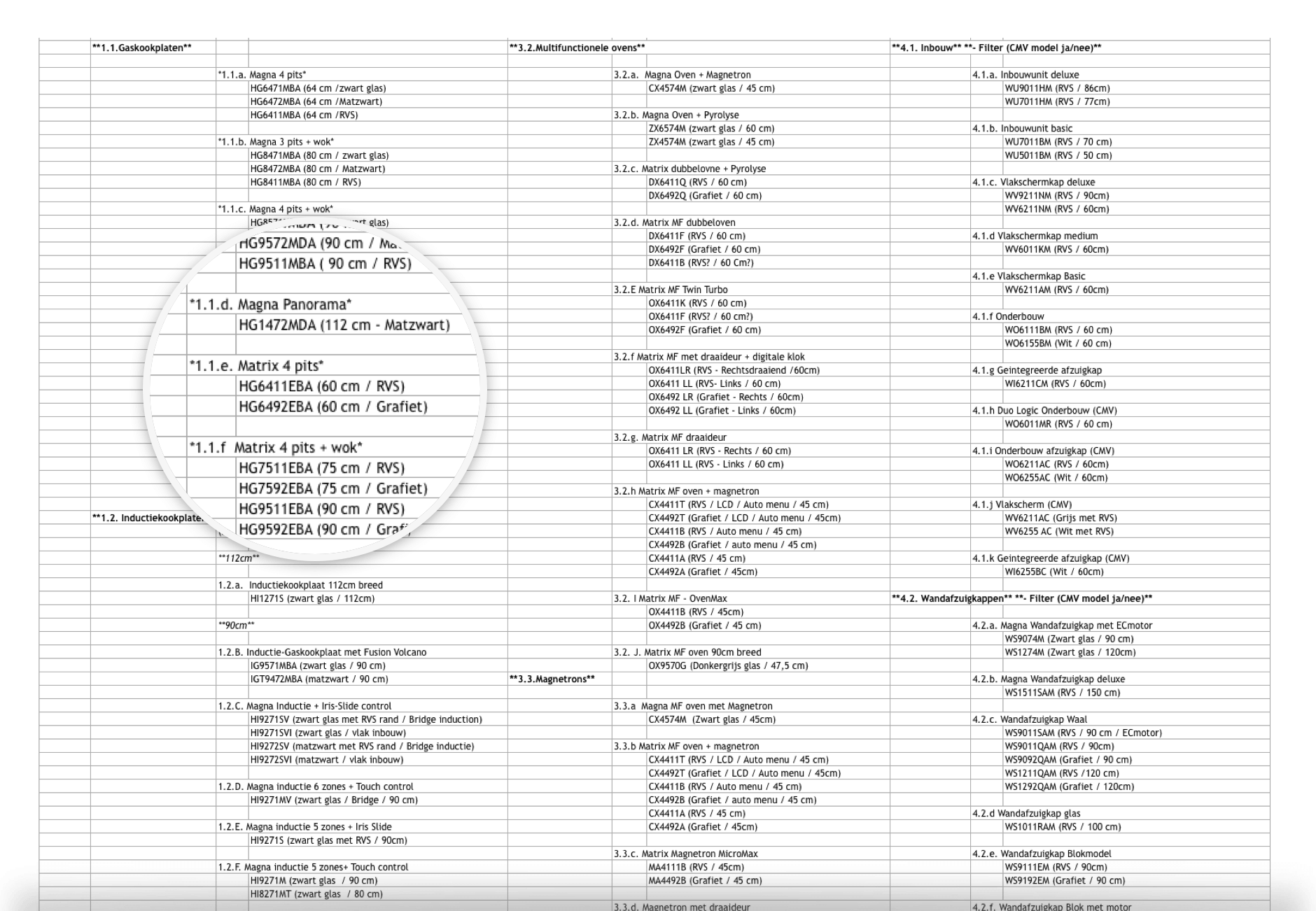
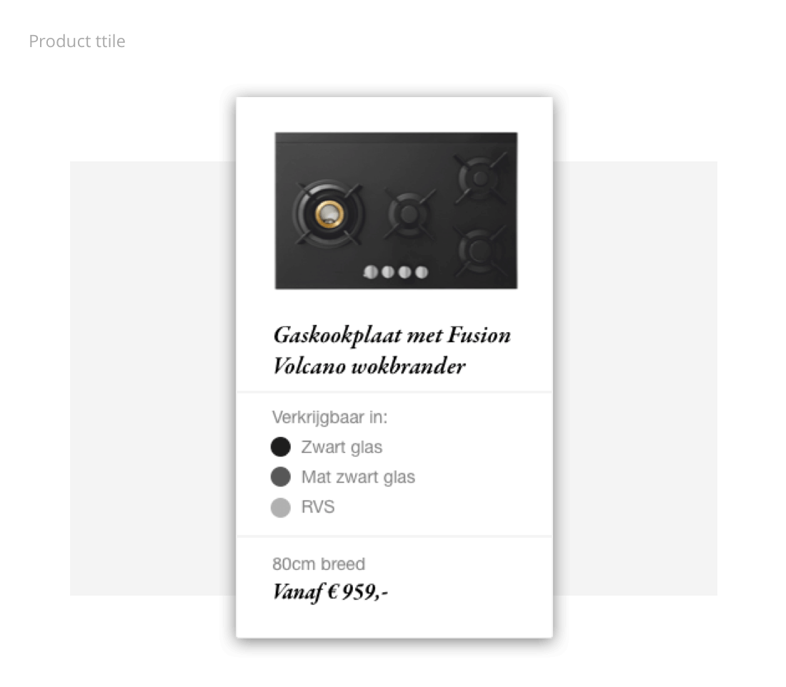
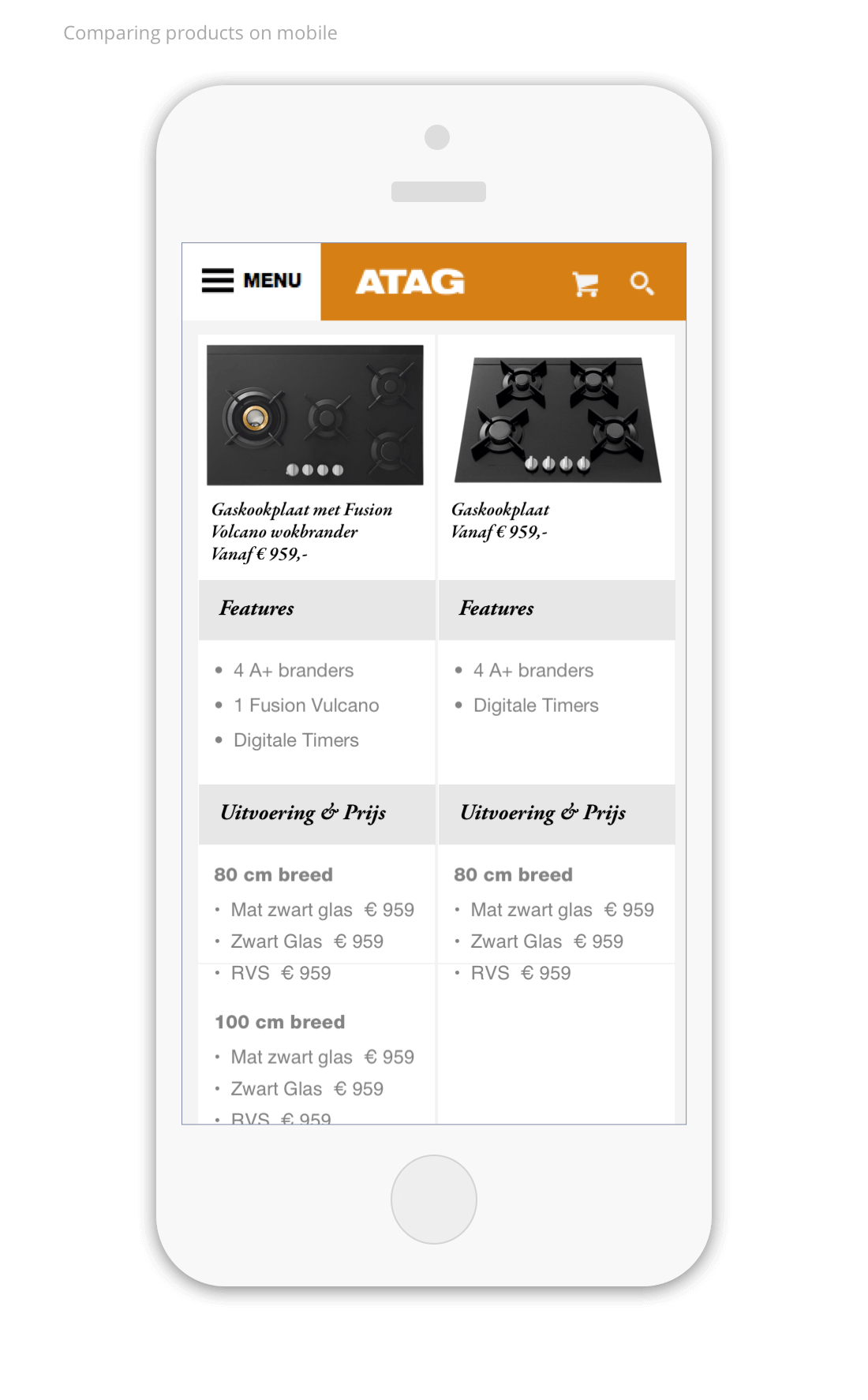
A second problem was that if we were to treat each and every serial number as it’s own entity, the overview pages of their products would become un-usable due to the large amounts of products which, except for the size and price, would look very similar from a user perspective. It became clear that we needed to ‘consumerise’ not only the entire brand, but also it’s product line. After some hours of collecting and scanning through all the of the available product information, i started restructuring them from a UX perspective by identifying similarities in products and categorising them into product models. Similar products with variations in size, material and colour would no longer be presented as separate entities but as a single model which is available in different options. By applying this categorisation the whole of the product collection became more streamlined, making the catalogue easier to digest.
Branding and Interface design
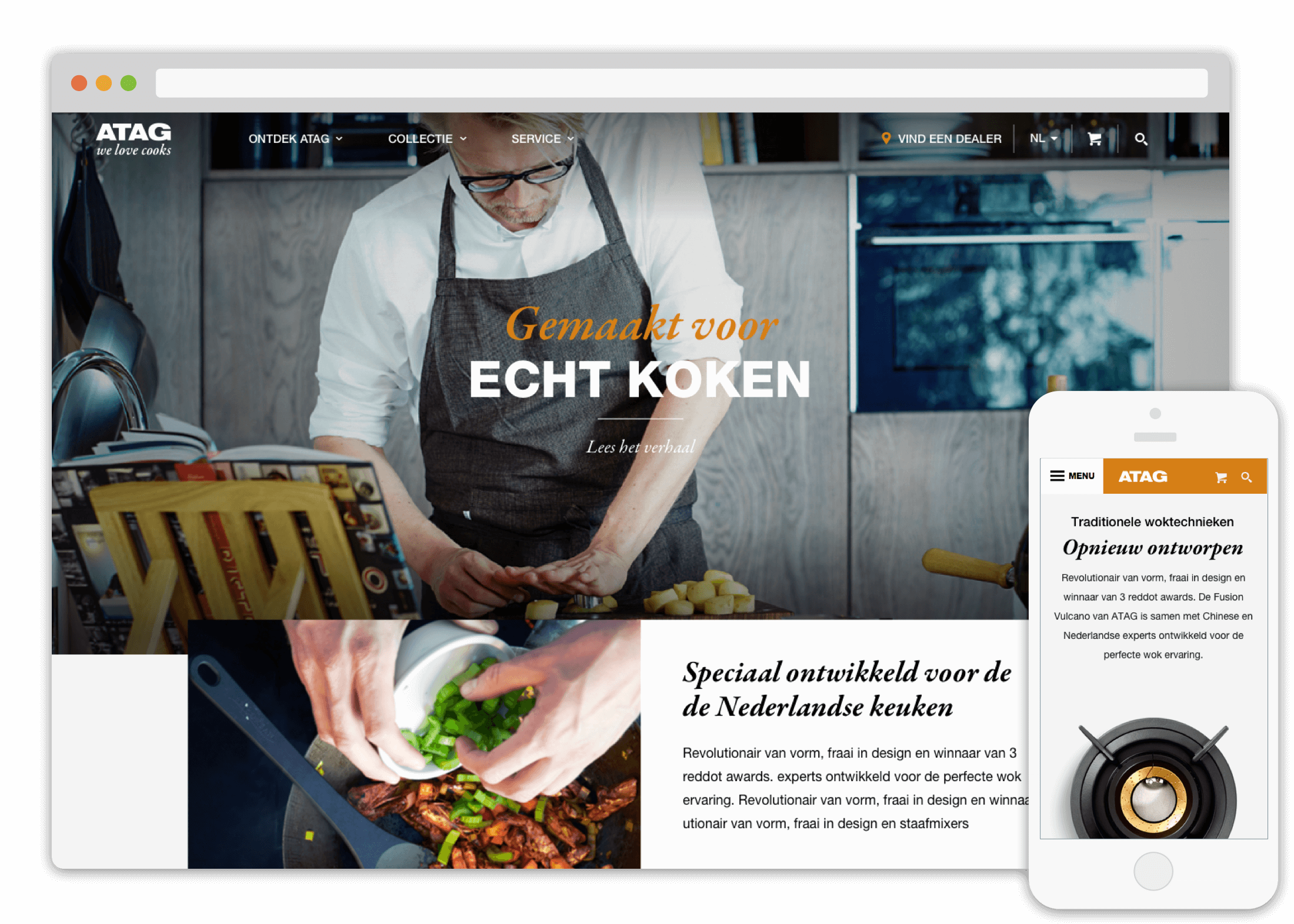
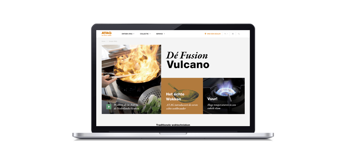
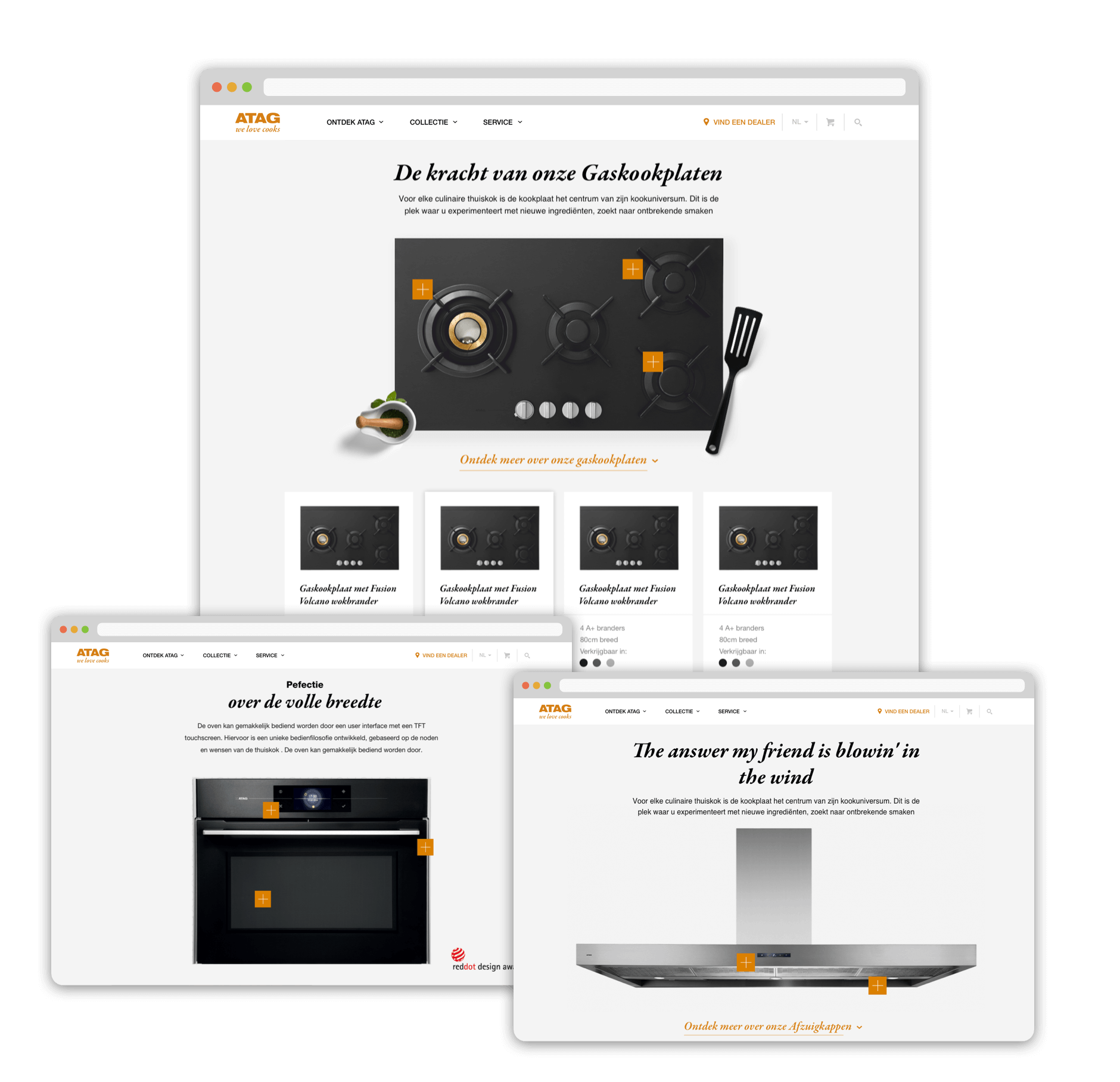
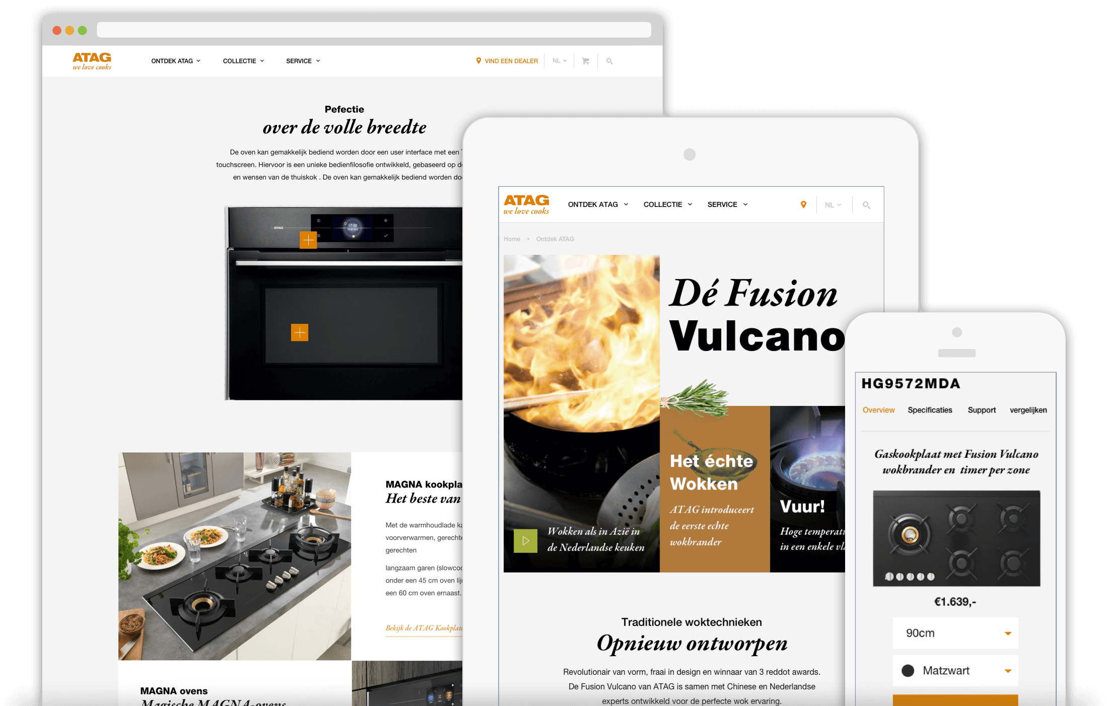
With the structure of the site complete, and also the branding and video production on track, we merged our work and began designing the visual aspect of the new website. A major part was of course the content and product presentation. By applying a very minimalistic style to the interface we made sure that the content would really stand out. The end result was an almost ‘apple-esque’ take on cooking appliances.
Result
The new ATAG website launched in november 2015 and although it didn’t immediately improve conversion or sales, the overall look and feel was definitely something both us and ATAG was very proud of. The most important accomplishment was that the new website resembled the vision for ATAG to move forward into the consumer market.